College hockey jerseys serve as iconic symbols, blending team pride with artistic expression. In the realm of collegiate sports, these jerseys become canvases, showcasing the rich history and unique identities of each institution.
As we delve into the world of college hockey aesthetics, this blog post unveils the Top 10 College Hockey Jerseys that transcend mere sportswear to become cultural artifacts.
From timeless classics to cutting-edge designs, these jerseys capture the essence of the teams they represent while resonating with fans across generations.
Join us on a visual journey, exploring the stories and inspirations behind each jersey, as we celebrate the fusion of style and tradition in the dynamic realm of college hockey.
Top 10 College Hockey Jerseys
Here, we have listed the most popular 10 college hockey jerseys. Check out the details of each jersey right below:
1. University of Maine Black Bears
The University of Maine’s hockey jerseys exudes elegance and style, earning them the top spot on this list. The two-tone blue palette, particularly the mesmerizing powder blue, captivates attention and sets the team apart.
The script on both home and away jerseys, with the distinctive underline formed by the “e” in “Maine,” adds a touch of sophistication.
What truly distinguishes the alternates is the incorporation of the school’s three-flag logo, lending the uniform a distinct collegiate charm.
The use of traditional blue tones without any compromise for cream or grey is a testament to the commitment to the team’s identity.
These jerseys, with their subtle yet striking design, deserve more visibility on television, reflecting the team’s rich legacy and the aesthetic appeal of their uniforms.
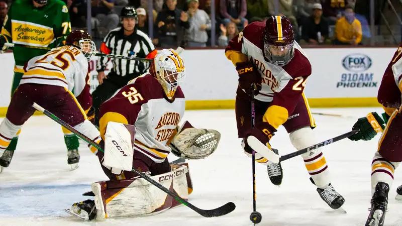
2. Arizona State University Sun Devils
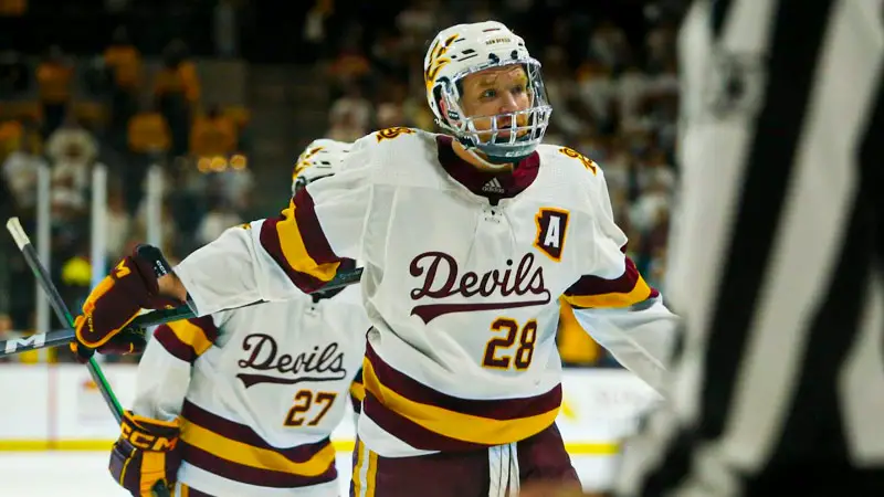
Arizona State University’s hockey jerseys emerge as a bold and dynamic statement in the world of college hockey uniforms.
Fresh off their inaugural NCAA Tournament appearance, the Sun Devils boast some of the newest and most visually striking uniforms in the nation.
Drawing comparisons to the Oregon of college hockey, the team showcases a plethora of colors and combinations, with Adidas crafting their uniforms in the sleek Adizero style.
With an impressive array of 135 uniform combos, including three jerseys, five helmets, three gloves, and three pants, the Sun Devils embrace a level of diversity rarely seen in college hockey attire.
The absence of white in both the road reds and alternate blacks, combined with the use of dark grey on pants and road uniforms, reflects a contemporary design sensibility that sets them apart from other teams, making a lasting visual impact.
3. Boston University Terriers
While the Boston University Terriers may spark a classic rivalry debate, their hockey jerseys undeniably stand out with timeless elegance.
The red and white color combination is visually stunning and possesses a unique charm not replicated elsewhere in college hockey.
The simplicity of the font, whether showcasing “Boston” or “Boston University,” contributes to the jersey’s classic appeal. A subtle shoulder stripe adds a touch of sophistication, seamlessly connecting the chest and shoulders in matching colors.
The all-red-away jerseys are appealing, but it’s the captivating contrast between the white sweaters and red pants on the home jerseys that truly stands out.
The Terriers’ commitment to a clean and identifiable design, epitomized by their old Frozen Fenway uniforms with the Red Sox font and skate shoulder emblem, adds an extra layer of nostalgia and pride for fans and players alike.
4. Northeastern Huskies
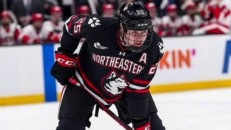
The Northeastern Huskies’ hockey jerseys boast a distinctive charm, particularly in their alternates.
Departing from the traditional white, the yellow and eggshell alternatives are eye-catching, adorned with the scripted “Huskies” on the front, underlined with a subtly skewed number.
The cream-colored uniforms, with their stylish simplicity, invoke a sense of classic elegance on the ice. However, the home and road uniforms, recently redesigned with a crest replacing the letters, pale in comparison to the beloved classics.
Despite this, the Huskies’ overall ensemble earns praise for its unique color choices, sleek designs, and the nostalgic appeal of the original jerseys.
5. Minnesota Duluth Bulldogs
The Minnesota Duluth Bulldogs’ hockey jerseys exude a timeless simplicity, featuring a standout bulldog logo. The maroon-dominated road uniforms, with their clean lines and yellow laces, create a visually appealing contrast.
Notably, each jersey sports a distinct shoulder patch, a rarity in college hockey. The throwback alternates, while not universally admired for their diagonal “Bulldogs” design, maintain a sleek aesthetic on the ice.
The additional yellow alternate, with mid-chest vertical striping, adds a touch of collegiate flair to the Bulldogs’ collection.
Overall, Duluth’s jerseys are characterized by a lack of flashiness, a focus on clean design, and the incorporation of unique elements, making them a noteworthy presence in college hockey.
6. Boston College Eagles
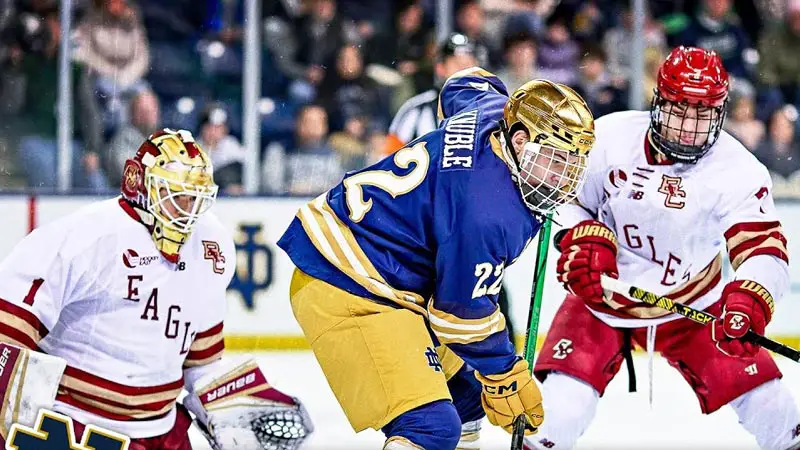
Boston College’s hockey jerseys, while not overtly flashy, carry a distinctive charm. The gold uniforms stand out as a fan favorite, with a classic appeal that resonates with many.
However, the alternates featuring an Eagle design receive mixed reviews, with some preferring the simplicity of “Boston College” or “Eagles” lettering.
The gold uniform, with its five thin stripes, adds a touch of uniqueness. A subtle and meaningful detail lies in the sleeve piping, mirroring the stained glass of Gasson Hall.
Despite these positive aspects, there’s a sentiment that the current jerseys may not fully capture the essence of BC’s identity, leaving room for potential rebranding toward a more retro and classic look in the future.
7. Alaska Nanooks
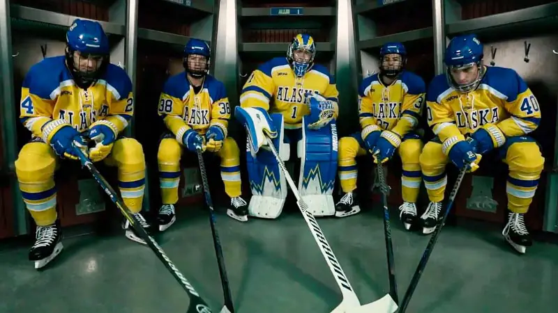
The Nanooks’ home and road jerseys are relatively straightforward, adhering to a blue, yellow, and white palette. The home jersey boasts a prominent “A” and a polar bear, while the road version displays “Alaska” across the front.
However, it’s their alternate jerseys that steal the spotlight. Featuring vibrant blue and yellow striping on the sleeves, the alternates introduce a dynamic element.
The elongated “Fairbanks” lettering, accompanied by an enlarged polar bear, adds visual interest. The polar bear, the only white element in the ensemble, provides a burst of color.
Despite the simplicity of the home and road designs, the alternates elevate the Nanooks’ uniform aesthetic, making them stand out in the realm of college hockey.
8. Lake Superior State Lakers
While the Lakers’ logo may not be a standout, their color scheme is noteworthy, reminiscent of the old-school St. Louis Blues with a slightly darker blue shade.
What sets them apart is the incorporation of cream, a refreshing departure from traditional white. The anchor emblem is a quality touch, although the plain font for “Lakers” and the white backing seem uninspiring.
Nevertheless, the overall combination of colors, including cream, adds a distinctive flair to the Lake Superior State jerseys, making them visually appealing despite some design nuances.
9. St. Cloud State Huskies
St. Cloud State’s hockey jerseys may not break the mold, but their uniqueness lies in the logo and subtle details.
The home whites and road blacks are solid, with the latter featuring an outline of Minnesota on the shoulders, reminiscent of the MLB’s Twins logo. Two-tone shoulder piping enhances the overall aesthetic.
The standout factor, however, is the third uniform – a striking red sweater with black pants. The script font complements the design, and the incorporation of the “ST” within the Canadiens “C” on various elements adds a subtle touch.
St. Cloud State’s jerseys gain recognition, especially with the success of the Huskies in recent years, making their uniforms iconic within college hockey.
10. Ferris State Bulldogs
Ferris State’s jerseys find distinction, particularly with their third uniforms. The bulldog logo, though somewhat cartoonish, provides a unique identity.
The third jerseys, reminiscent of retro BC uniforms, evoke a sense of nostalgia with bright yellow hues, giving them an appealing 1980s aesthetic.
Despite initial reservations about the distinctive bulldog design, it ultimately sets Ferris State apart from other teams sharing the “Bulldogs” moniker in collegiate hockey.
The script font adds a classic touch, and the alternates, with their retro vibe, could even be considered as a permanent road uniform, providing Ferris State with a distinctive and memorable hockey ensemble.
FAQs
What makes a college hockey jersey stand out in the Top 10?
College hockey jerseys are evaluated based on unique designs, vibrant colors, and meaningful symbols representing the school’s identity.
The combination of aesthetic appeal and a strong connection to the institution’s history often distinguishes the top jerseys in collegiate hockey.
How do teams earn a spot in the Top 10 College Hockey Jerseys list?
Teams secure a place in the Top 10 through a mix of fan popularity, historical significance, and innovative jersey designs.
The list considers both traditional powerhouses and emerging programs, recognizing the balance between classic styles and modern creativity in jersey design.
Is there a particular era or style that dominates the Top 10 College Hockey Jerseys?
The list encompasses a broad spectrum of styles, from classic and timeless designs to modern and sleek aesthetics.
While some jerseys evoke nostalgia with retro elements, others embrace contemporary trends. The diversity reflects the rich history and evolving fashion within the college hockey landscape.
How often does the ranking of the Top 10 College Hockey Jerseys get updated?
The rankings are periodically updated to reflect new jersey releases, redesigns, or notable events in college hockey.
Typically, updates coincide with the start of new seasons or major tournaments, ensuring that the list remains relevant and captures the latest trends and innovations in jersey design.
Do fan opinions influence the Top 10 College Hockey Jerseys list?
Yes, fan opinions play a crucial role. The list is curated with input from hockey enthusiasts, considering popular votes, social media polls, and fan forums.
This approach ensures that the rankings resonate with the passionate college hockey community, reflecting the jerseys that fans find most appealing and iconic.
Wrapping Up
In the world of college hockey, jerseys are more than uniforms—they’re symbols of pride, history, and the vibrant spirit of the game.
As we wrap up our exploration of the Top 10 College Hockey Jerseys, it’s clear that each jersey tells a unique story.
From storied rivalries to innovative designs, these jerseys stand as testaments to the creativity and passion that define college hockey culture.
Whether you’re a die-hard fan or a casual observer, these jerseys serve as a visual journey through the heart and soul of collegiate sports, leaving an indelible mark on the landscape of sports fashion.


James Felix